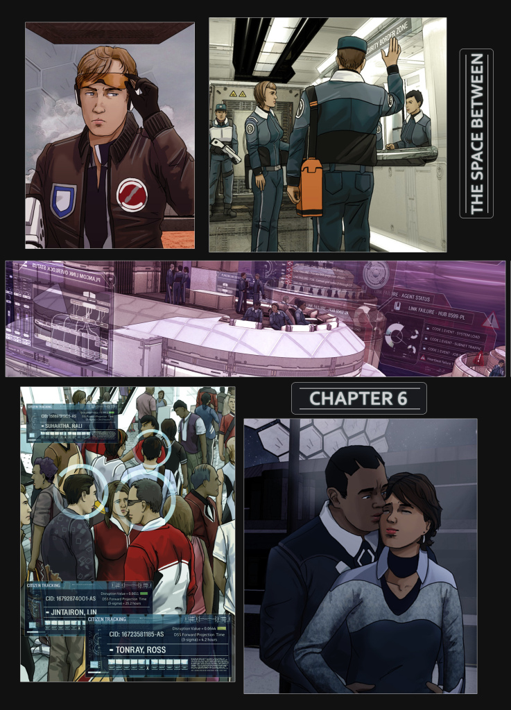
Work on Chapter 6 is going well. It’s a long one, and I’m currently on page 11 of 18.
In answer to a query from abhifx last week, here’s a brief run-through of my process for producing new pages:
1-Script:
All of the story has been laid out in advance in script form. I wouldn’t do this any other way, as I don’t think making the story up as you go along leads to good results. I’m not a natural writer and I find writing to be a difficult mental puzzle, albeit rewarding when the parts all click into place. I hope this deficiency can be overcome with a brute-force approach of repeated edits over a long period of time. The script gets another one every time I read part of it.

2- 3D renders of locations:
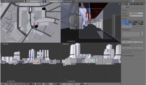
All of the locations are built in Blender. I’m not greatly skilled with 3D modelling, but I decided to use it for all the backgrounds for two main reasons:
Practically all the locations are non-organic in nature, and therefore well suited to artificial construction instead of free-hand drawing.
Hand drawing backgrounds is *very* time-consuming. With 3D, once the initial overhead of building a location is complete you can render any number of shots very quickly. Locations also remain consistent over time.
The challenge when initially exploring this approach was visually matching the renders with the hand-drawn art, but a few set photoshop filters now takes care of this. I have to avoid making the 3D models too detailed or they don’t match the more simplistic line-art!

3 – Storyboarding a page:
I start a page by making really crude sketches of panel and dialogue layout on a sheet of A3. I find good old-fashioned pencil and paper can’t be beat for ease of translating thought into form. This only takes about 15 minutes – it is very badly drawn. 🙂
4 – Drawing a page:
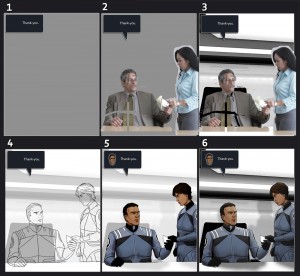
Here’s the big bit. I’ll run through it in 6 distinct stages. The tools used are an ancient copy of Photoshop and my beloved Wacom Cintiq:

4-1 Panel and dialogue layout:
The storyboard is translated into a framework to draw onto. Initially I tried doing the same clever things with panels that I’d admired in other comics – non-rectangular panels, breaking panel boundaries, unusual flow between panels. This was exhausting and I quickly gave it up in favour of a very rigid 3-2-1 panel arrangement and fixed rules for the positioning of dialogue boxes. I think this was the right decision, as it turns this stage into a fairly efficient, mechanical process, and this is not always a bad thing in art.
Incidentally, I know the addition of the mini-dialogue heads will be contentious. I’ve toyed with various alternatives and can only say that I find this to be the least worst option. They add some much-needed colour and visual pop to the page, and are useful in identifying which character is speaking in situations, as will occur frequently, where they are not present in the associated panel.
4-2 Adding reference:
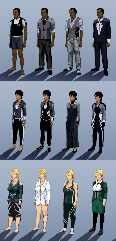
I find that for good results, reference is essential. I used to chafe against this fact, and saw it as ‘cheating’, but I’ve now come to embrace it. So at this point I go searching a variety of image sites for pictures of people in poses that match the storyboard. Often these references will need to be collaged together, and tweaked to better match the build of the characters they are representing.
A note here – finding good references in microgravity is very hard! This is the reason I decided to downplay the visual effects of microgravity from those originally planned, and characters spend little time free-floating.
4-3 Adding background renders:
For each panel, the background is rendered from the appropriate location. The image gets run through a few photoshop filters to add outlines and help it match the hand-drawn art better. Matching the references to the background is tricky, especially when they are physically interacting with it, such as sitting down.
4-4 Line art:
My favourite part of the process! Although the line art is drawn over the references, only the outline of the form gets used. I keep a separate file of references for characters and clothing.
4-5 Colouring:
This part is rather mechanical – colouring in! I usually work without strong object source lighting, using a reference palette for skin and clothes. Too much attention to shading, especially on faces, can really trap you. I do find it necessary to have some video or music playing nearby to help keep this stage from becoming too tedious.
4-6 Applying filters, background details
Filters are added to all the new layers. These add a colour overlay to reduce contrast and saturation, a soft light gradient and inner light shadow to help them sit more naturally on the backgrounds. Shadows, light glow, data displays and other extra background details also get added at this stage.
5 – Final edits
Like the script, the page will require several more edits, usually made months later when all the other pages in the chapter are complete. Distance in time is important for re-assessing any work. Key priorities are clearing up any obvious visual errors, especially ‘derp-face’ which is common, and adding elements such as data displays or background crowds which I didn’t have the energy to add in the first pass.
For example, the shadow behind Jaime’s head in the example above looks instinctively out of place and I’ve already fixed it by moving it off the the left.
I hope this was of some interest. A wonderful and sometimes frustrating aspect of any creative endeavour is that there are so many right (and wrong) ways to get to your destination. This is the one I’ve settled on after some trial and error and I want to stick with it, hopefully avoiding much of the stylistic drift that can occur over time. Let me know if there are any additional questions, I’ve spared you from plenty of tedious details. 🙂
Cheers,
Mark
